Blue Tokai
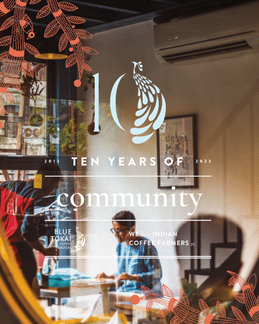
Just before launching Knight Design in 2023, Niharika served as the Creative Director at Blue Tokai Coffee Roasters. As Blue Tokai was entering its 10th year, a strong brand refresh was needed to capture the much-loved buzz of their amazing coffees. From assembling a strong design team complete with aestheticians, illustrators, graphic designers, and skilled desktop technicians, to building a visually rich, youthful, and diverse design system—including product packaging and café redesigns as key touchpoints—the brand was ready to move into its next decade.
Niharika, along with the design team, the marketing department, and in close collaboration with the founders, helped shape the new design world of Blue Tokai.
Team:
Creative Director: Niharika Jain
Design Team: Safa Khan, Saurav Roy, Maira Bose, Ajay Saxena, Divisha Suman
Photography & Videography: Raminder Kochar, Aradhya Kumar
Marketing Team:
Director of Marketing: Pranav Sawhney
Project Manager: Nishchal Patnaik
Head of Content: Kavya Chaturvedi
Content Team: Srishti, Aroshi, Shivani
On ground activation: Priyanka & Abhishek
Special thanks to: Namrata Chittaranjan, Matt Chittaranjan, and Shivam Shahi
Rebranding, Packaging design,
Cafe design, Art Direction, Graphic design and so much more.
Packaging
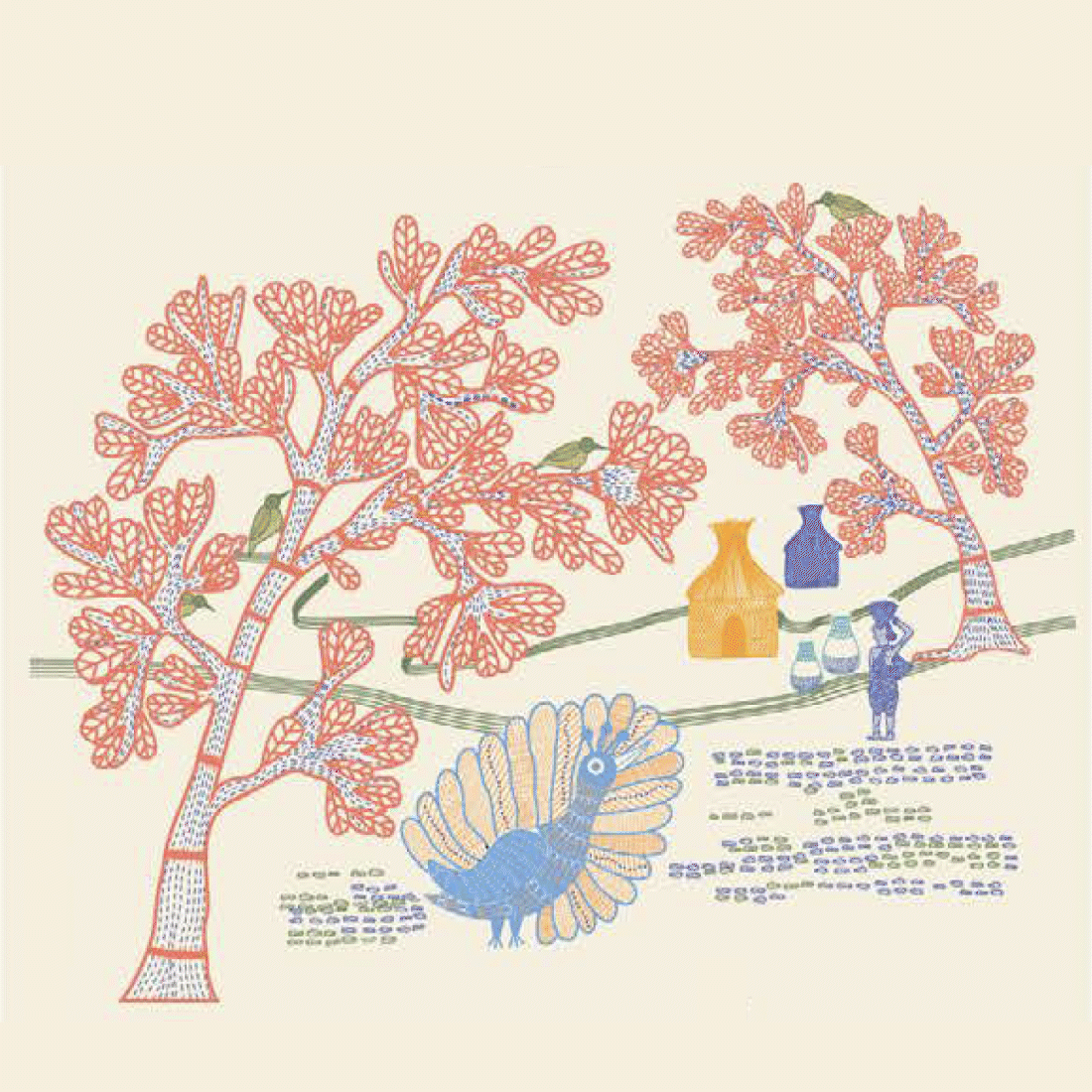
The Classic Pouches


Classic Pouches, or Classic “Ouches” as we lovingly called this redesign journey, was a year-long exploratory, iterative saga we embarked on as we attempted to create the new face of the main packaging touchpoint.


From initial loud and proud explorations, that were bright, and POP to say the least we navigated our way to figuring a new look and feel that not only told a story but also caught eyeballs in the retail space.

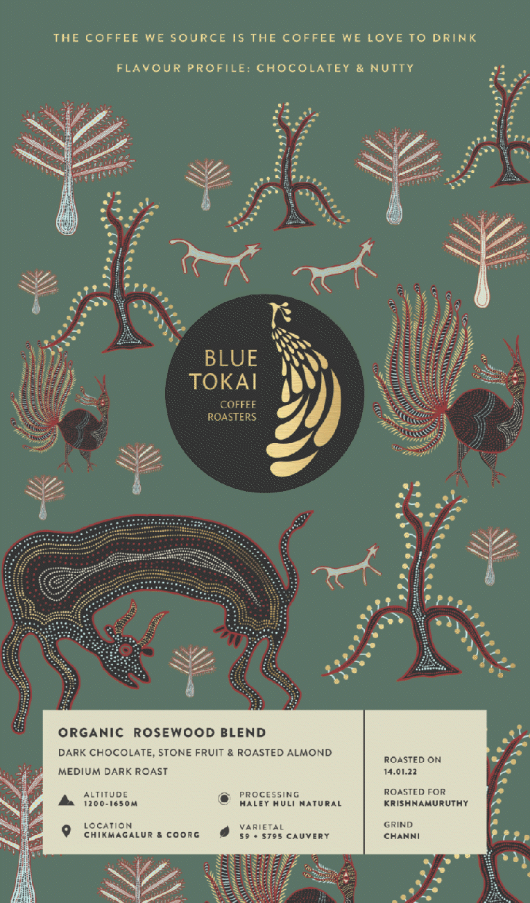


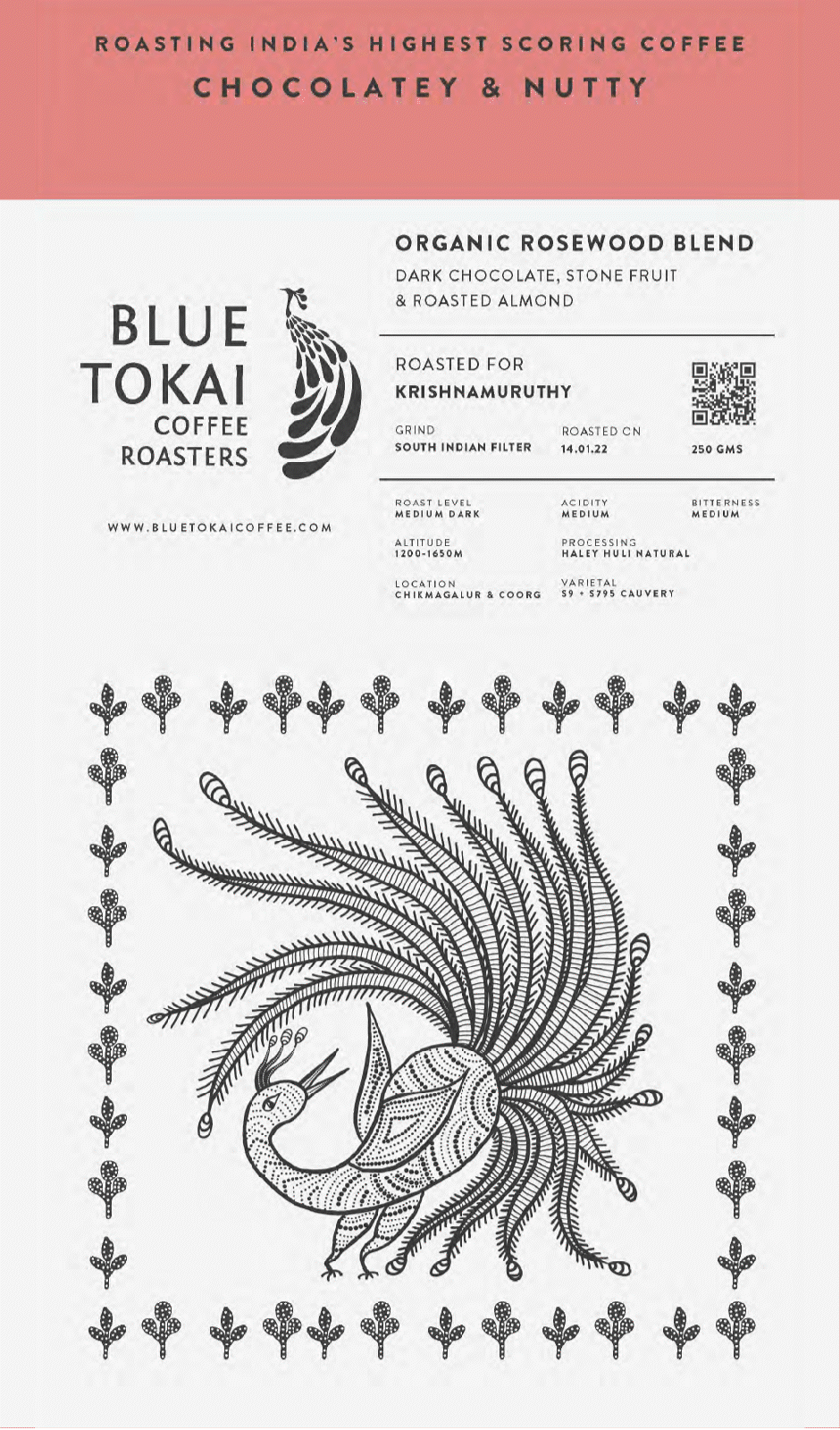

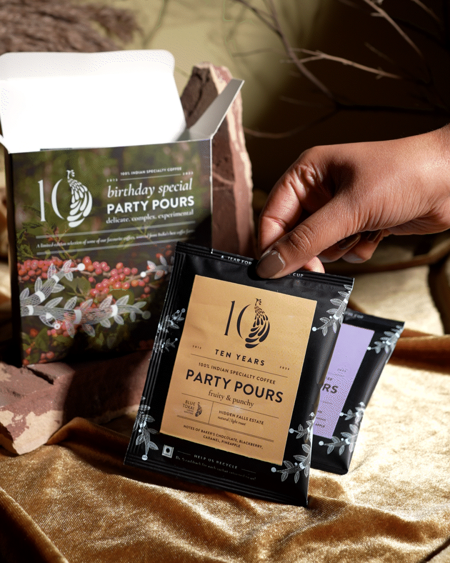
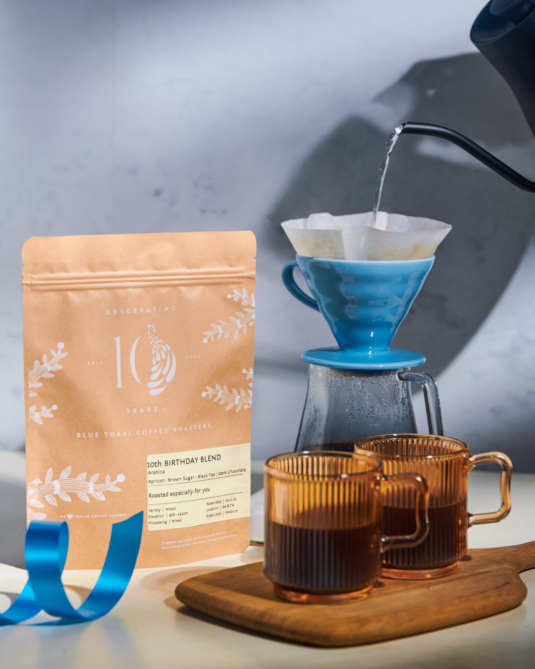
After several iterations, we arrived at a core belief, that is one of the founding pillars of Blue Tokai. We love Indian Coffee Farmers. Agricultural coffee landscapes with peacocks were illustrated, inspired by traditional Indian artforms, each showing the love for the farmers who painstakingly pick the coffee cherries.


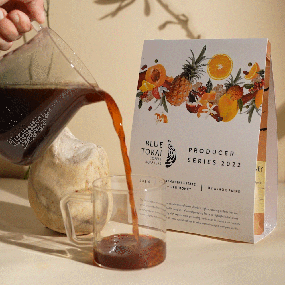
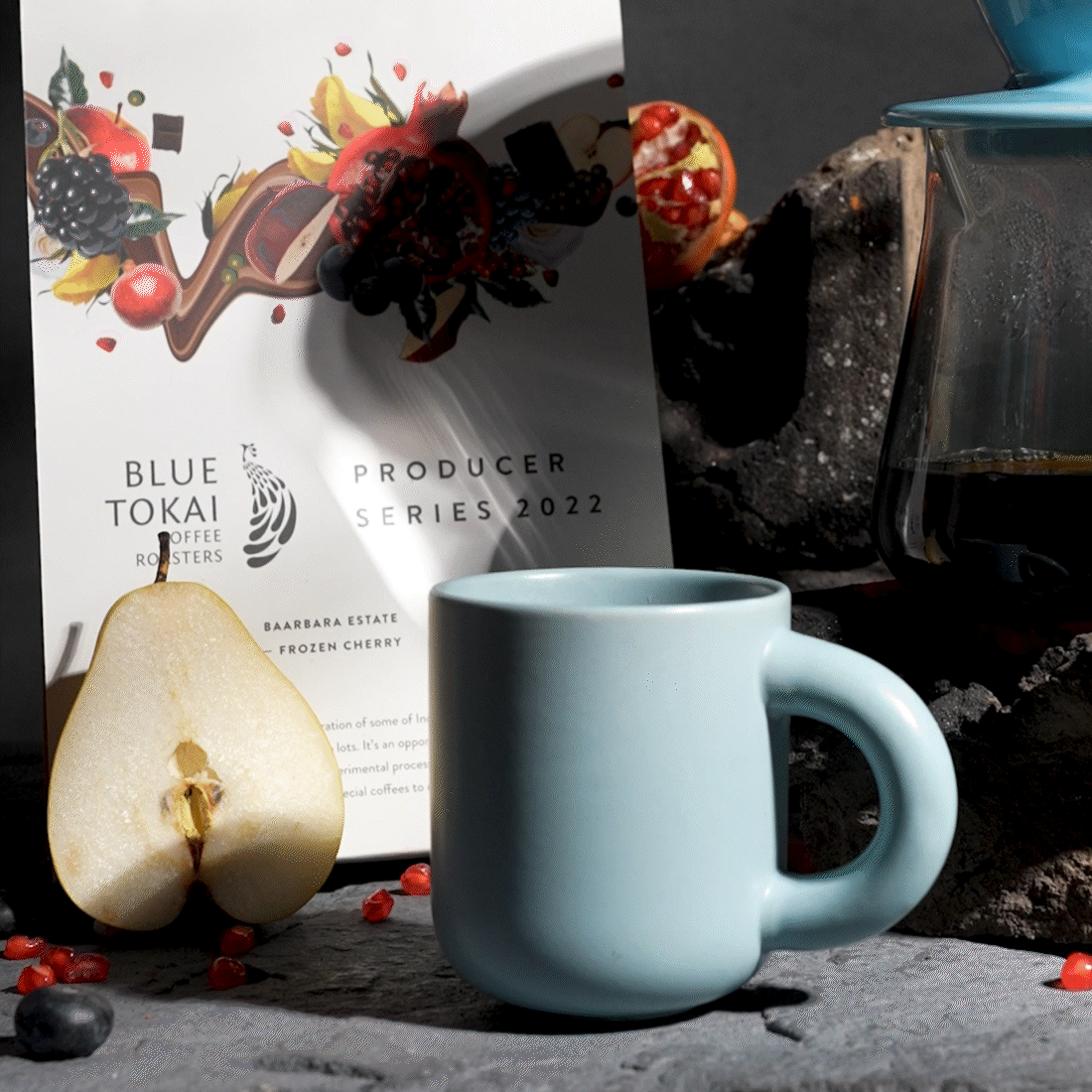
The Producer Series
The Producer Series features the most experimental coffees produced in India, each year. The design language had to emphasise the premium, limited-edition nature and the expert craftsmanship of the producers, highlighting an elevated coffee experience with unique and experimental flavor profiles.


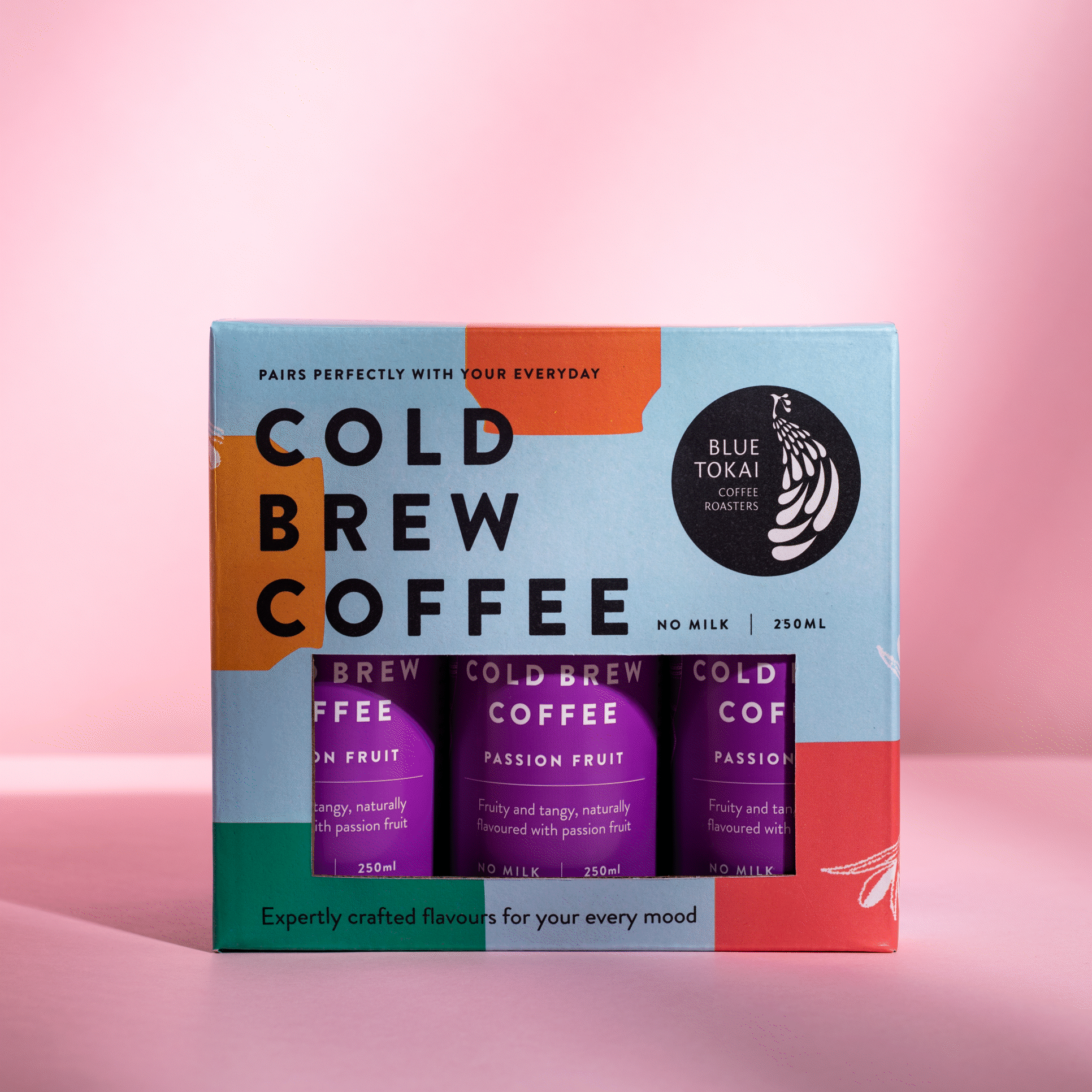
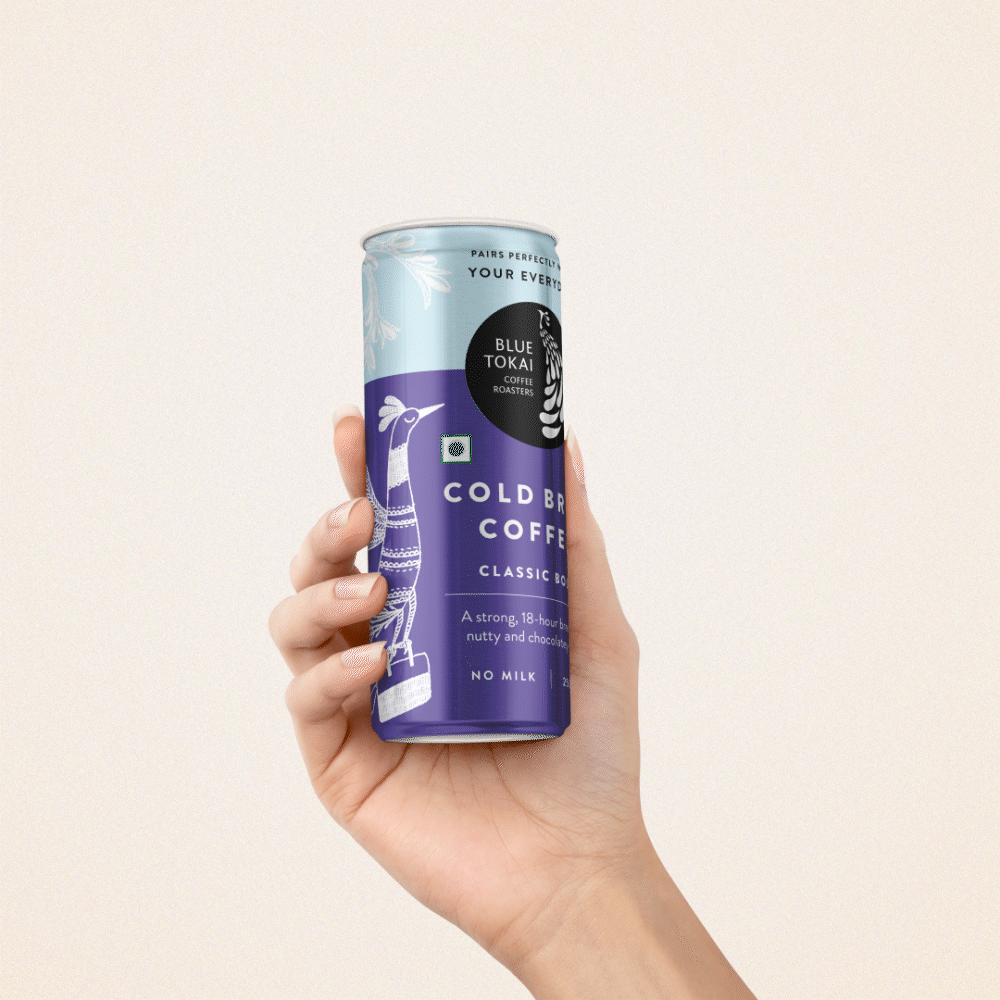
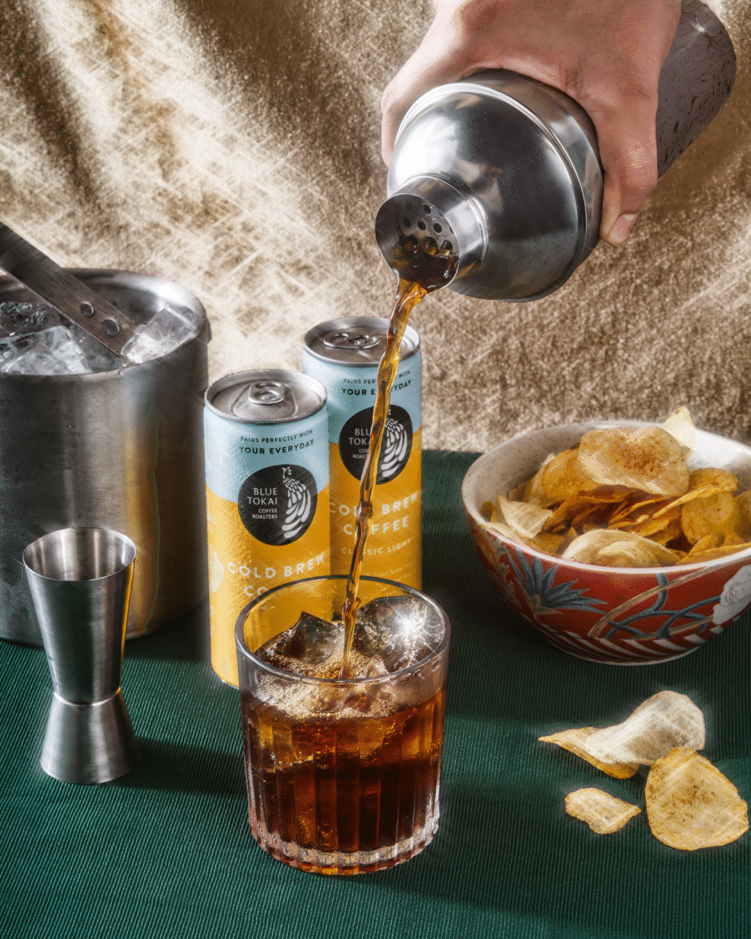
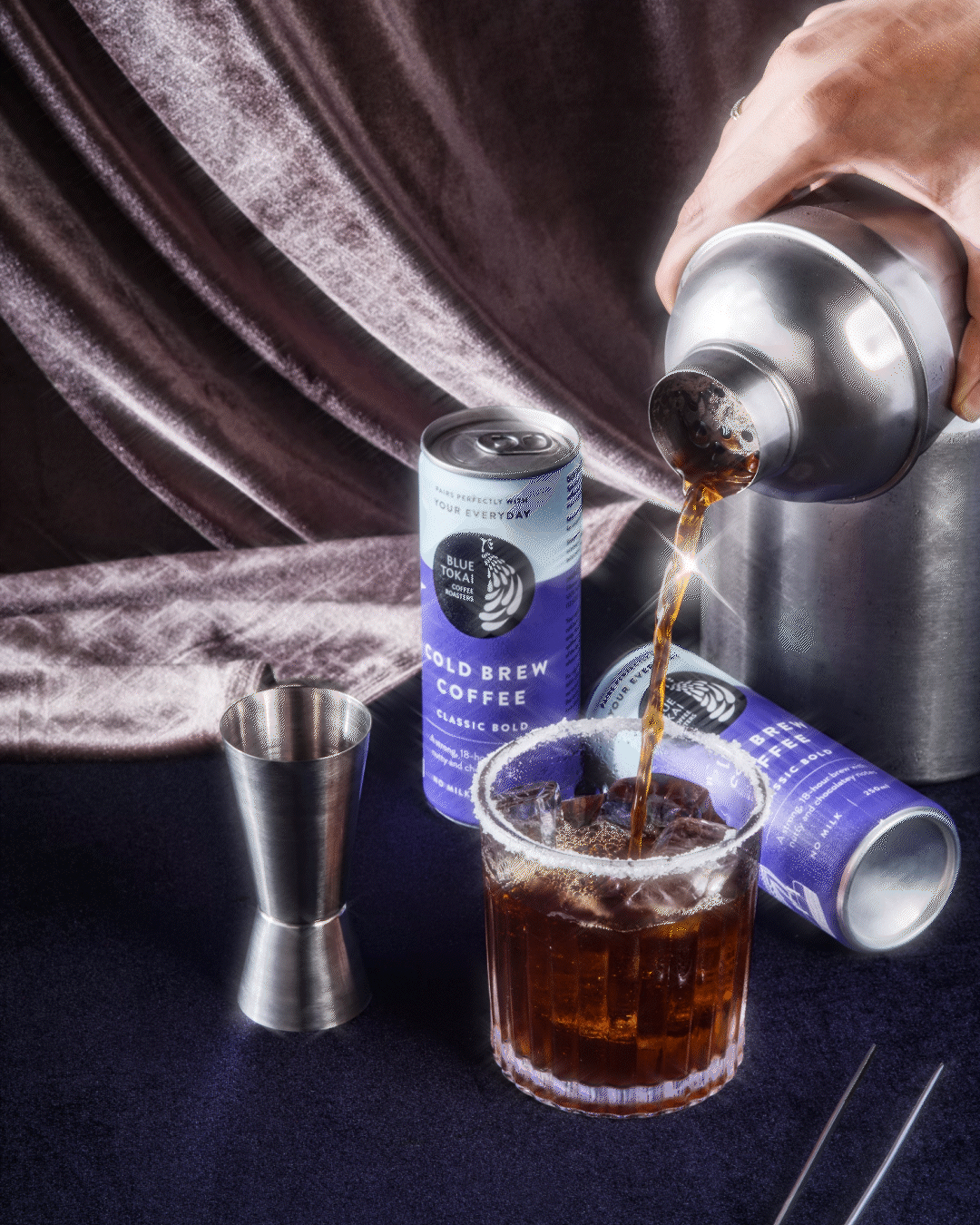
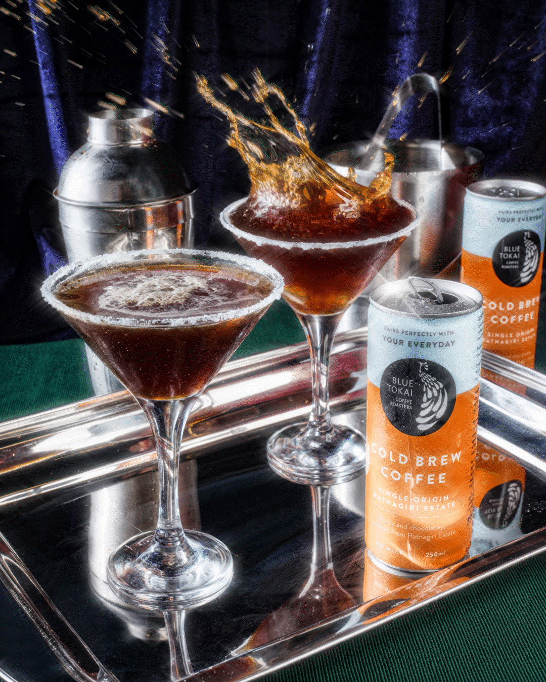
Cold Brew Cans

One major re-packaging project was for the Cold Brew Cans. We aimed to create a design system that would stand out and command more visual space on the shelves and in fridges in FMCG aisles. By anchoring the design with the color blue and incorporating bright accents, we achieved strong brand recall and a banner-like visual effect as the cans were lined up. Additionally, we transitioned from a short, stout can to a tall, sleek can to enhance its contemporary look and maximize shelf presence.


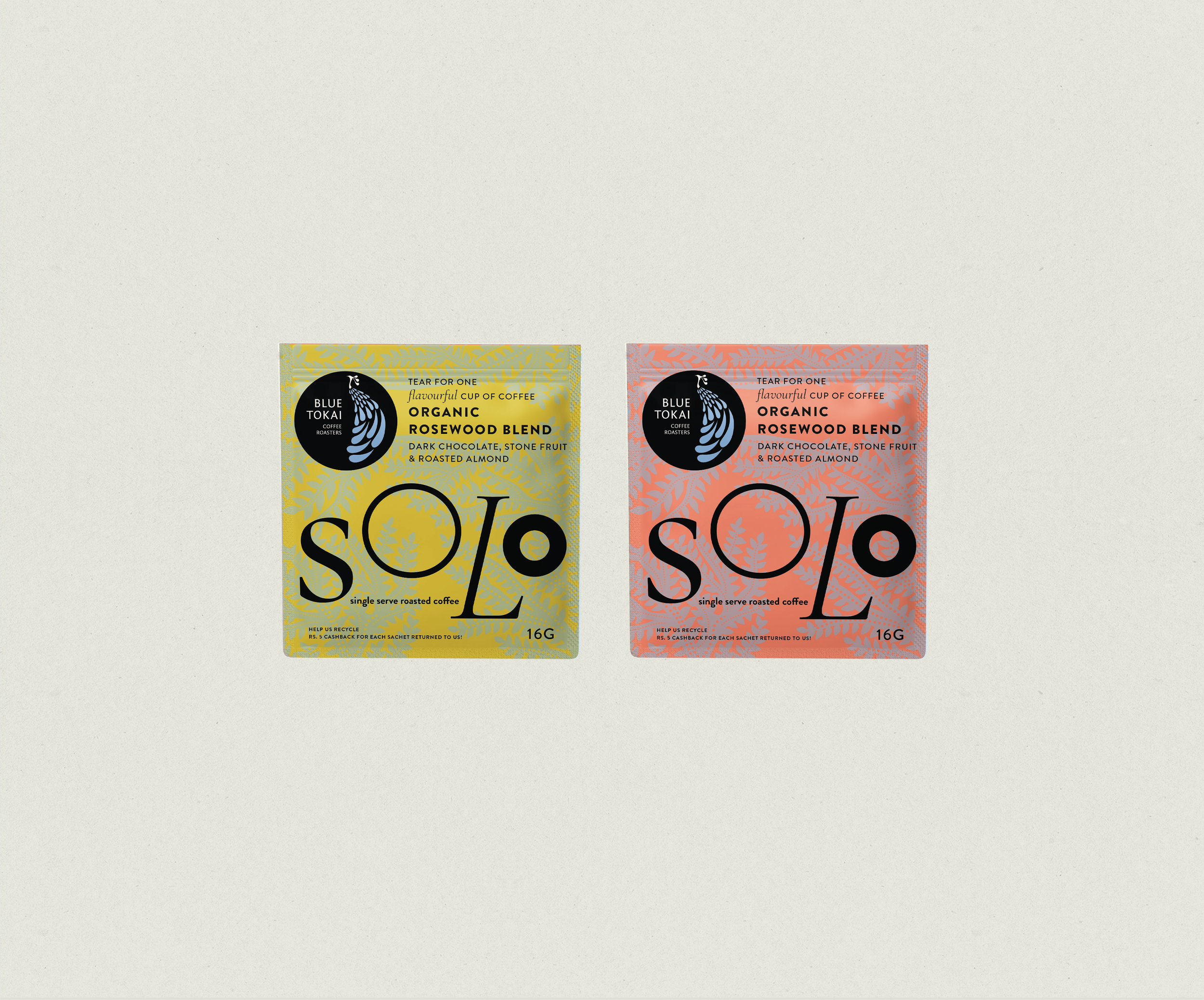
Solo Packs


Design explorations for SOLO, the single serve coffee sachets

Takeout Packaging


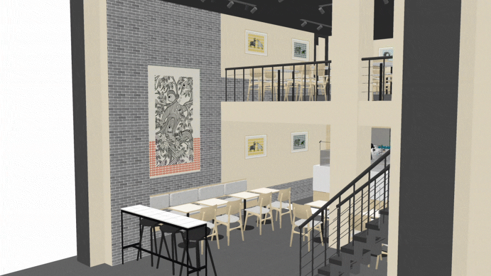
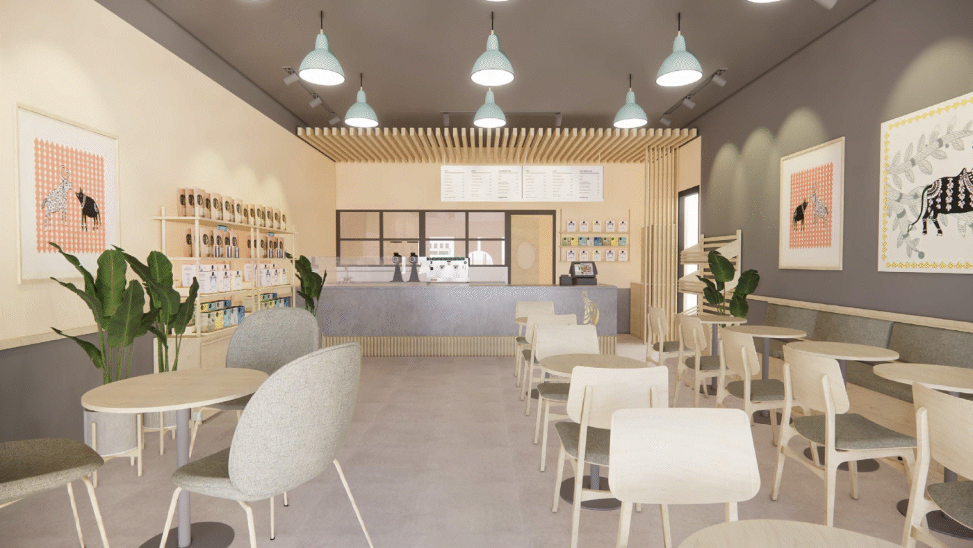
Cafe Design
We extended the redesign into the café spaces as the company expanded, overseeing 18 new locations. Large artworks, adding a pop of colour, paired with grey brick walls and wooden furniture, were introduced to create a warm and inviting atmosphere. Additionally, we updated all the front facade signage to the Blue Tokai blue, reinforcing a strong brand presence, owning the colour, and facilitating brand recall.


Art Direction
Art direction had to be elevated to bring the brand to a more contemporary and refined space.
The "Gatsby" shoot for the festive season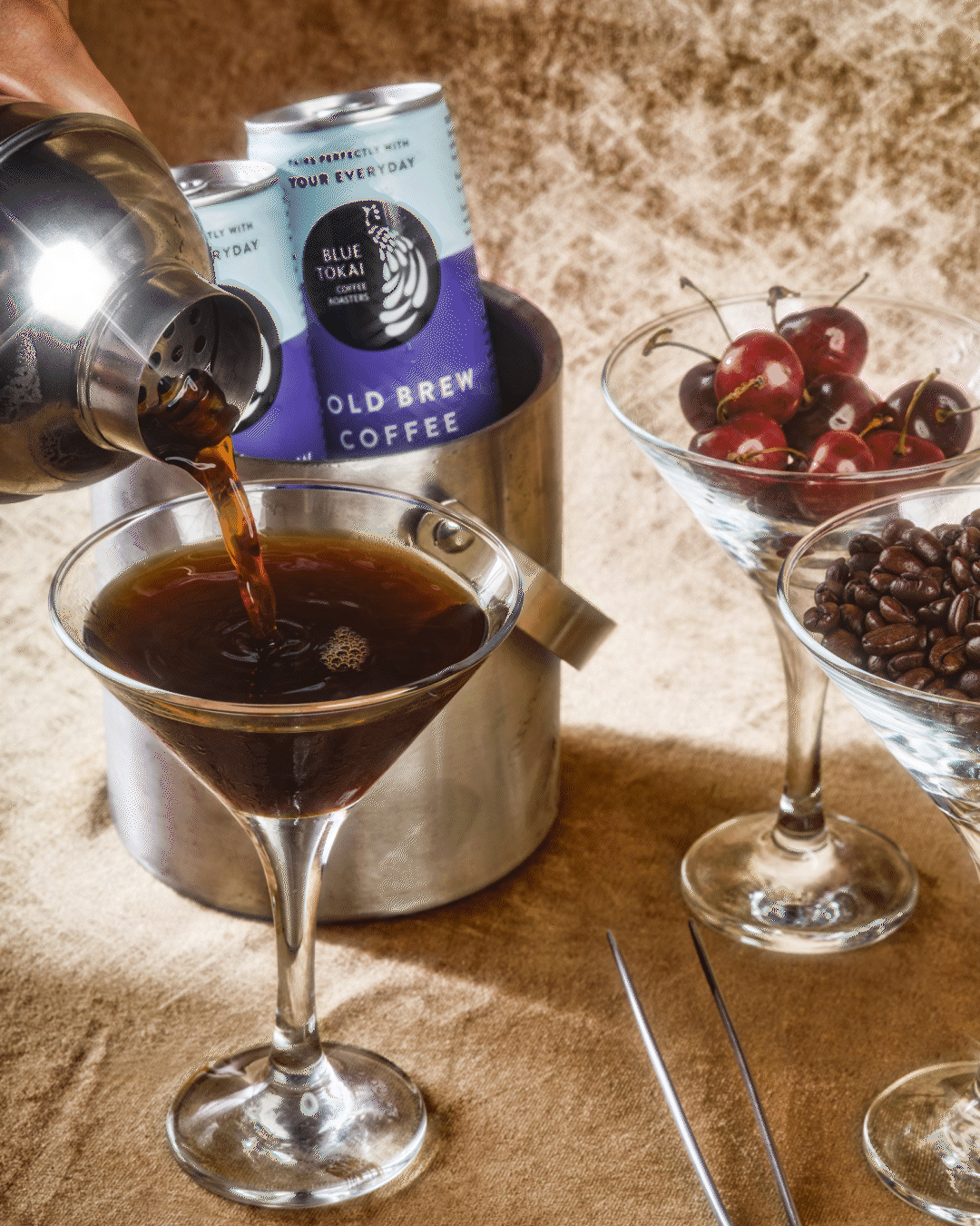
The "Earthy" Shoot

Campaigns
10TH ANNIVERSARY


THE PLAYBAR PROJECT


Cafe Offerings
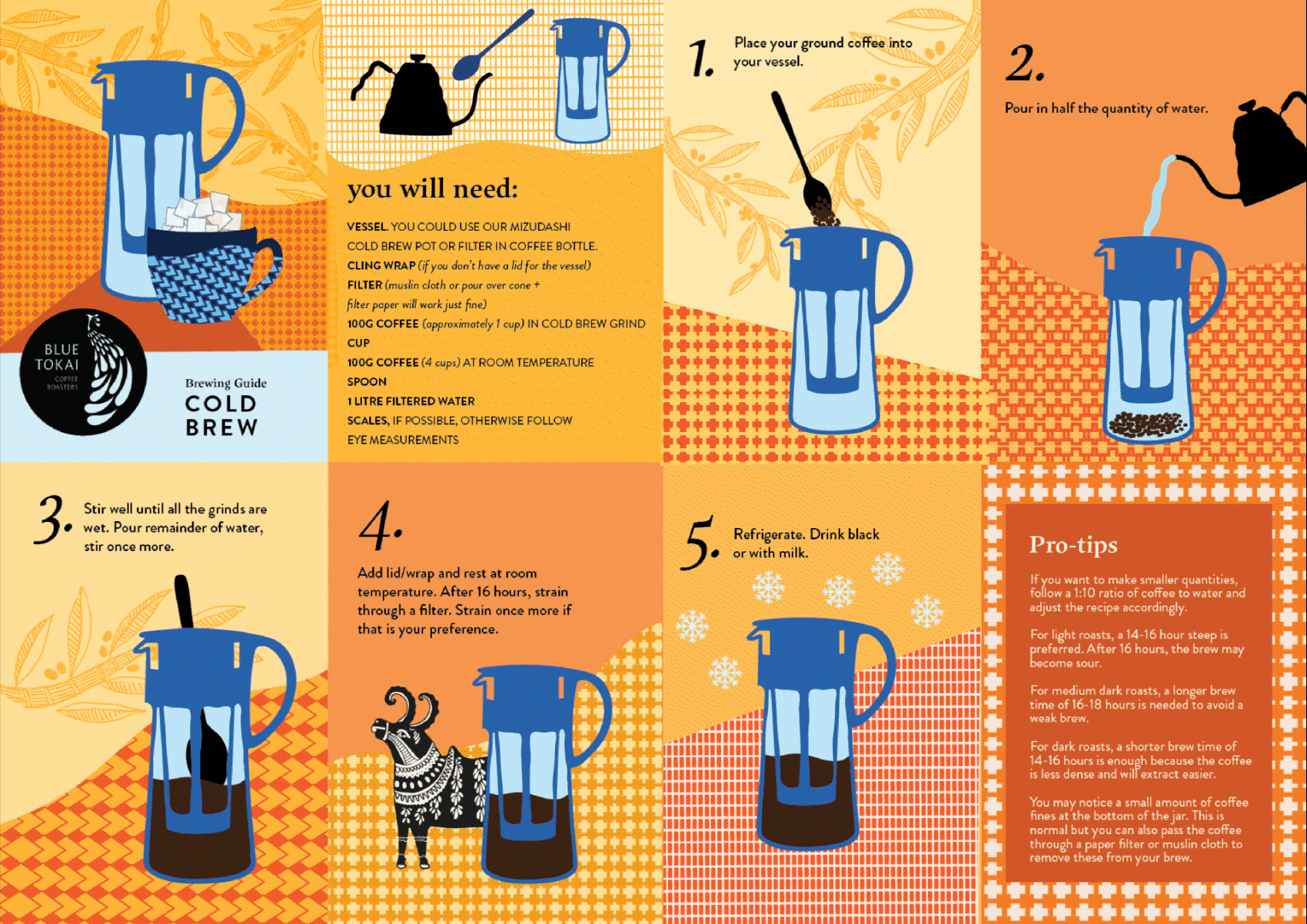
Good design considers both form and function. The aggressive café expansion required us to make the café offerings and brewing methods accessible to the new cities we were entering. Overhead menus, redesigned zine-like brewing guides, and our own take on the flavor wheel were created to achieve this goal.
OVERHEAD MENU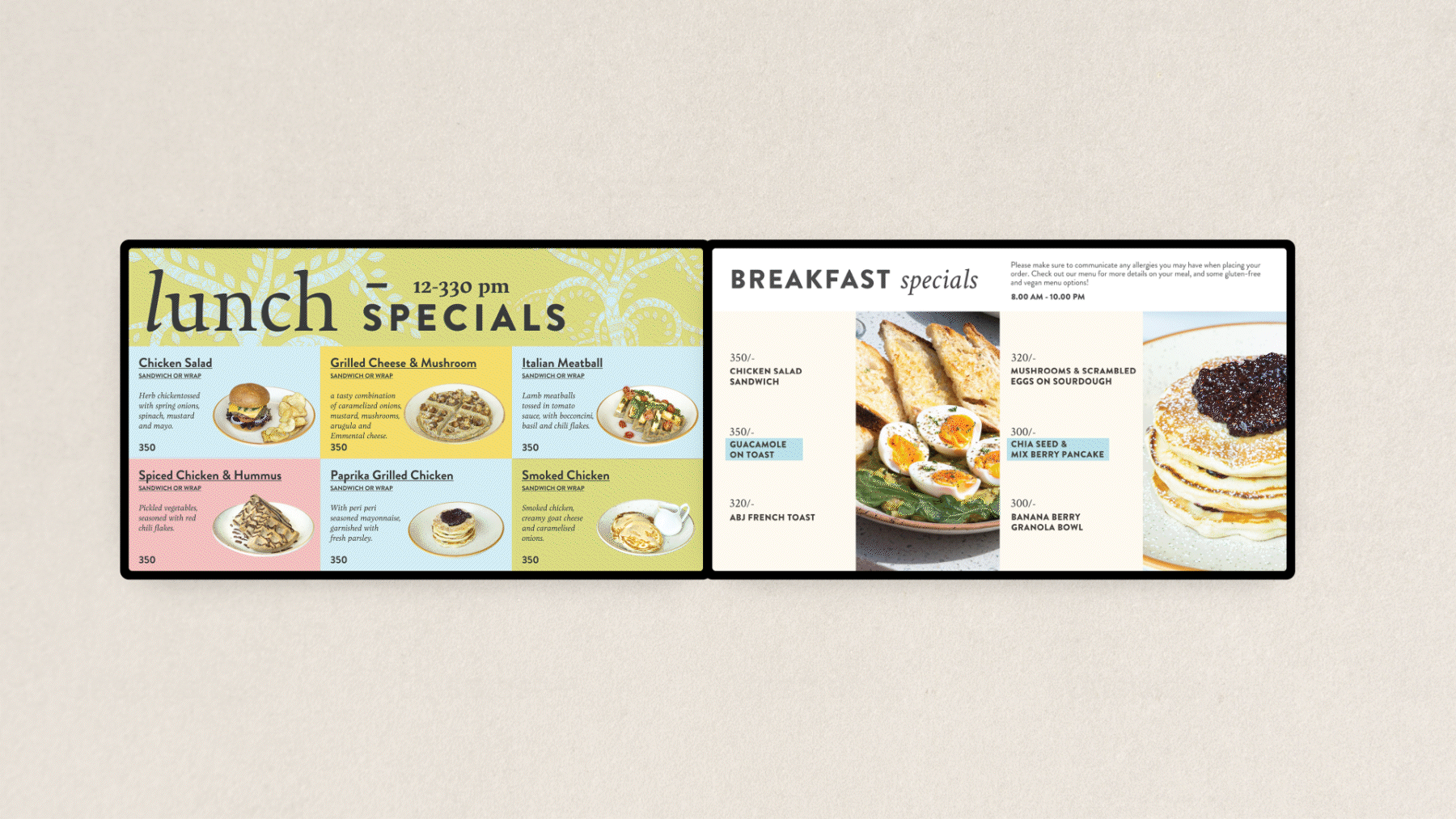


BREWING GUIDES